


With big data visualization techniques, you can turn every large, complex data set into easy-to-understand graphs, infographics, charts, videos, and timelines.
Organizations can then use this data to understand their processes better and improve their performance.
Visual analytics enables you to communicate the insights derived from these data trends to help stakeholders understand the complexities of organizational data.
It’s, therefore, important that you make these data insights as actionable as possible.
So what is big data visualization, and why is it important?
Let’s find out.
What is Big Data Visualization?
Big data visualization is the breakdown of large volumes of complex data into visual graphs and charts that make it easy to interpret.
Companies collect data in different forms from vast sources using various tools.
For instance, CRM and CX tools collect customer information from your website and social media. Combining this CRM and customer experience data will provide more value to your marketing needs.
There’s a need to represent such information with actionable visuals to make the insights accessible to non-technical audiences.
This includes both simple representations of graphs, charts, and histograms and more detailed charts like heat maps.
Why Big Data Visualization is Important
Over the next five years, statistics project that global data creation will grow by over 180 zettabytes. This points to a growing information overload crisis. And all that data would make no sense if you can’t use it to derive actionable insights.
Having actionable big data visualization techniques helps businesses:
- Get the most value out of data and make the data easier to interpret
- Simplify large chunks of data for easier decision-making
- Identify risks and mitigate them
- Reveal unexpected patterns, trends, and correlations.
Here are ways you can make your data more actionable through big data visualization.
Actionable Ways to Improve Your Big Data Visualization
For your visualizations to have the most impact, you need to follow a well-planned process. Here are tips to help with that.
1. Know Your Audience
Your audience is the first crucial ingredient in your big data visualization process. This includes what they expect from the chart and whether you’re presenting your information to a technical or non-technical audience.
This way, you’ll pick only crucial data and avoid overloading your chart or graph with unnecessary information.
For instance, if you’re preparing marketing visuals for leads you’ve generated using tools like ZoomInfo, your target audience will be largely non-technical, and you’ll need to keep your charts simple and straightforward.
This detailed and appealing big data visualization, for instance, is complex enough for a more technical audience.
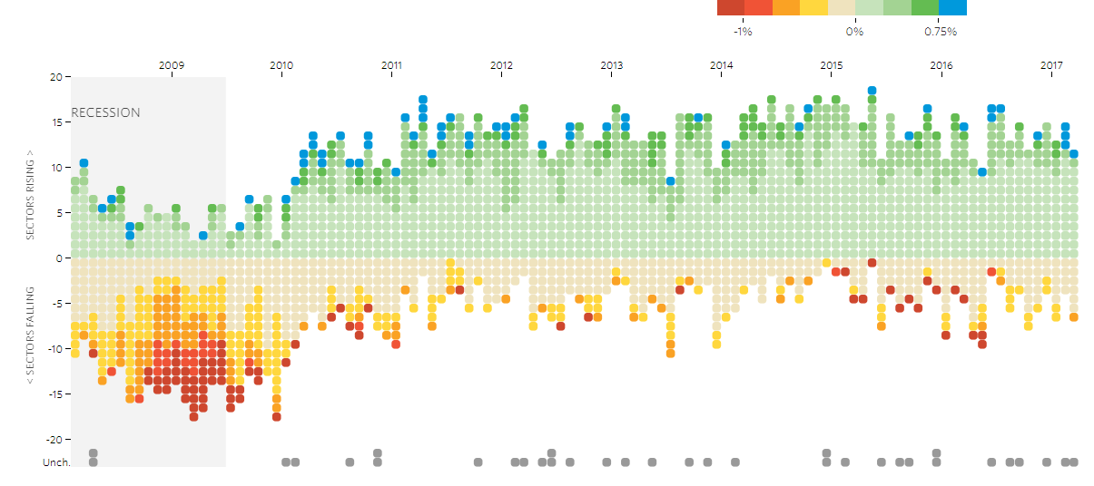
Image via WSJ
The information needs of your audience will guide you towards producing visuals that are more actionable to them.
2. Label and Frame Your Visualizations
To make your big data visualization more actionable, label your charts in a way that’s easy to read and understand. You’ll also need clear frames on both axes of your plots.
Make sure you include a title on your visual that summarizes the information it conveys. Then, make sure you label both axes for more clarity.
If there’s a lot of data on the plot, you could incorporate a legend. But sometimes, labeling your plots directly makes your visual easier to interpret.
3. Pick the Right Data Visualization
There’s a hoard of ways to visualize big data, and selecting which one to use can impact your data insights. Here are some common visualizations you can pick from.
- Bar graphs: These are simple visualizations that are easy to interpret. They are most suited for capturing large changes in trends over time.
- Line graphs: They are mostly used to compare information over a long period and capture small changes in data trends.
- Histograms: These represent data distribution much like bar graphs, but the only difference being that they represent how frequently data is distributed within a given range.
- Pie charts: Show the distribution of items in a similar category in proportions.
- Scatter plots: They’re used to highlight correlations between two different variables.
These are the more common visuals that are easy to interpret. You can also use a combination of the above for more detail, like below.
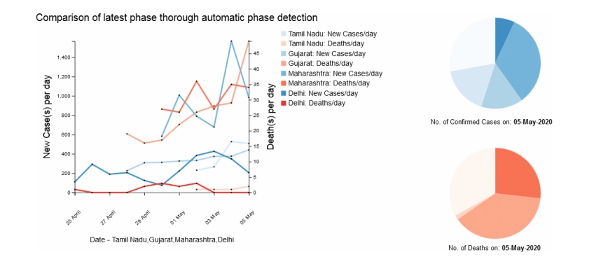
Image via ACM Digital Library
4. Use Preset Color Palettes
Colors are a very crucial part of data storytelling and visualization and can make a huge impact on how your charts appear. Therefore, when in doubt about the color pattern to use, always go for the preset ones on your data visualization tool.
The schemes are pre-selected for uniformity, so your visuals will look neat. Here’s an example from Adobe.
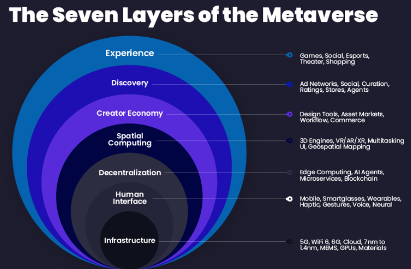
Image via Adobe
Your color sets also need to distinguish various items on your big data visual.
Another important tip is to use varying tones of the same color to illustrate diminishing intensity, like below.
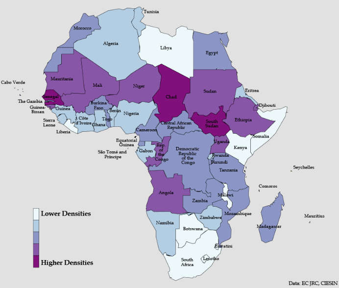
Image via Africa Center for Strategic Studies
Also, it’s always more appealing to use colors that people can already relate to in your big data visualizations. For instance, you can use yellow to show hot weather.
Another common example would be when comparing data between countries; it’s more appealing to represent each country using a color from their flag. For instance, using dark blue to represent the US or red to represent Canada.
5. Keep Your Visualizations Simple
While it’s important to capture every necessary detail in a visual, having too much data on it will only distract the viewer.
It’s important to be both thorough and minimalistic. The simpler you can make the visual, the easier it will be to interpret. Avoid any unnecessary patterns, such as grids, shadows, lines, etc., that do not help your viewer understand your data.
Here’s an example of a bar graph with unnecessary detail.
Image via Southeastern University
Instead, you could simply represent the same information as shown below in a better manner.
Image via Southeastern University
Improve Your Data Visualization Today
Big data visualization is key to improving your business performance. It helps you make sense of all the data you’ve collected and helps you derive actionable insights from it. These insights, in turn, can help in managing your business expenses and improving your business decisions.
And there are many tools that can help you interpret this data and gain useful insights. From labeling to color coding, if you take care of each aspect, these visualizations can come in very handy.
All the best in making your data more actionable.
