


How comfortable are marketers in 2021 with storytelling with data? That’s the big question a new data marketing study asks.
2020 has shown us the importance of data ”charts and graphs abounded, not just about the pandemic, but the large-scale changes to everyday life.
But data on its own doesn’t tell a comprehensive story. In fact, what many marketers have found is that presenting data as is can be confusing. It can even turn audiences away.
That is why telling a story with data has become one of the core focuses of marketing efforts this year ”it’s a powerful tool for sharing information.
The best way to tell data-driven stories is by using data visualizations. They can enhance existing messaging ”such as text or audio ”or be shared on their own.
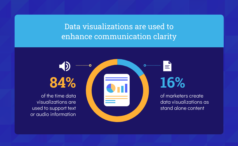
Source: Venngage
With more people online now, creating more memorable stories has become a priority ”and data can help tell those stories.
Are Marketers Using Data Storytelling?
Collecting data is only one part of the marketing and sales strategy ”the data needs to mean something to audiences and encourage them to act.
There is also a lot of data available online ”to rise above the noise, businesses need to make their data easier to understand and more impactful.
It’s important to remember that numbers in and of themselves can be meaningless ”meanings have to be assigned to them.
The best way to do that is by creating visuals that show connections between the data, and it looks like marketers are already doing this, according to the data storytelling study.
Source: Venngage
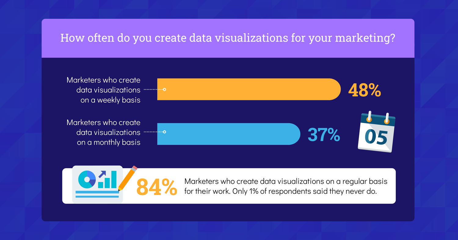
84% of marketers design visualizations for data on a weekly or monthly basis. That’s how necessary data has become for brands tapping into consumer marketing psychology.
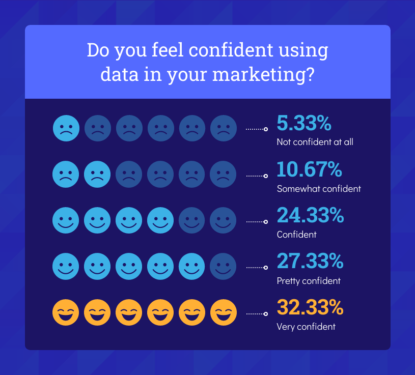
Because of this steady growth in data collection and visualization, marketers have become more confident in their ability to use data in marketing campaigns.
Source: Venngage
84% of marketers were confident that they could use data well in their marketing efforts. Though the level of confidence varies from industry to industry.
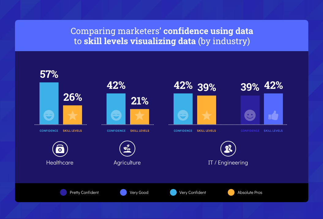
From the 338 marketers surveyed, the healthcare, agriculture, and IT industries were the most confident using data. Although their skills didn’t always match their confidence.
Source: Venngage
Despite the slight discrepancy between confidence and skill level, marketers across the board are improving their ability to gather data and tell stories with it.
How Can Marketers Tell Stories Using Data?
Marketers need to follow a few simple steps if they want to use storytelling data well. These steps will also help them create visuals that are meaningful and impactful for consumers.
Use Reliable Sources
One of the best ways to tell a good story is to use reliable sources. Consumers want to know that they can trust the data they are looking at.
You can create the most attractive visuals, but if the source of your information is faulty or misleading, you will lose credibility.
In this study on bad infographics from 2020, it was found that some news sources made critical errors when sourcing their information for data visualizations.
This led to misinformation and panic among audiences, and the kind of bad press that businesses want to avoid at all costs in their media relations.
The best way to create memorable stories with data is to source information from reputable sources. The sources also have to be relevant to the story you are trying to tell.
Use Simple Tools
Marketers, especially those without much experience with storytelling through data, can get bogged down about the right tools for visualizing information.
There are numerous visual tools online ”many of which are free ”that can be used to design effective data visualizations.
It’s also important to remember that the story you tell with your data doesn’t have to be encased in an elaborate design to make sense.
If you have the right data and a powerful message, a simple design can do the same job.
Understand Your Audience
For storytelling with data to be effective, you need to understand your target market. What are they looking for in your message? What stories will impact them?
Most importantly, you want to find out what your audience most cares about so that you can create data stories that will not only attract them but increase their engagement with your brand.
If you’re trying to share information with a B2B audience about health and safety measures, creating a data story around the best ways to keep your business open would be the way to go.
Declutter Your Visuals
Data storytelling only works if the people looking at your visuals can understand them. Take a look at this infographic, for example.
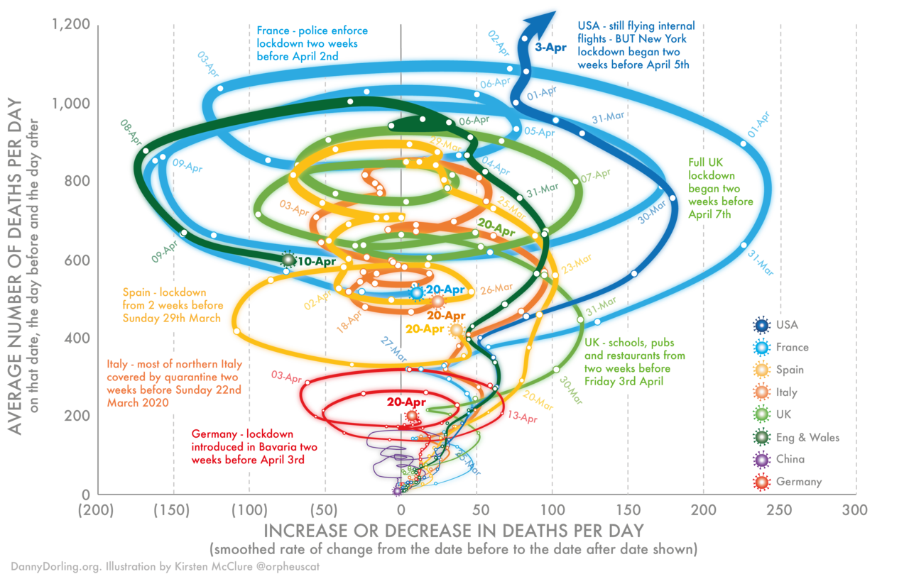
Can you understand what the visual is trying to say? No. It may be colorful and attractive, but it’s so hard to decipher that it can’t tell a story. As a result, the consumers of the visual will scroll away to look at something that makes more sense.
Declutter your visuals as much as possible ”it’s one of the basics of graphic design that marketers can forget when creating visuals.
Don’t include more data than is necessary for your story ”it may be interesting to you, but if it doesn’t add to the experience, leave it out.
If your pie graph has too many slices, you may be including too much information. The same goes for bar graphs.
Stick to one method of conveying data. If you’re using percentages, use them throughout the visual. Don’t change to other amounts halfway through.
Use icons to denote data points instead of writing text explaining what a point represents ”this saves space and looks attractive.
Create Connections
The entire point of using storytelling data is to make connections and show patterns that your audience may not have been aware of.
There are numerous ways to build connections in the stories you create:
- Use similar sizes for related data points
- Increase the size of data bubbles to show growth
- Group data using colors or hues
- Add an annotation for a significant data point
Don’t make your reader work hard to understand the story behind your data visualization. Tell them as much as you can within the visual itself by creating comparisons.
Key Takeaways: Visuals Make Storytelling With Data More Impactful
Marketers are becoming more comfortable with different storytelling techniques, chiefly storytelling with data.
Although marketers are more confident using data than their skills would attest to, this is an information-sharing method that is picking up a great deal of interest.
We have shared the most important findings from a study on marketers’ comfort with data visualization, as well as some top tips for creating data stories that are effective:
- Using reliable sources
- Investing in tools
- Understanding audience needs
- Making clean visuals
- Creating connections
With these insights, marketers will be able to create better and more impactful stories for their audiences in 2021.
