


IoT is one of the coolest trends that has been positively affecting every industry sector. Be it retail, industrial, or manufacturing, IoT is revolutionizing each one of them slowly and steadily. While many industry leaders have deployed IoT devices in their facilities, they haven’t let the technology outdo itself.
One common challenge that almost every business faces with IoT is data gathering, analysis, and visualization. As per stats, there will be around 64 billion IoT devices worldwide by 2025. Those of you who have deployed IoT at your workplace must also have multiple devices like sensors constantly emitting data.
This data, if not used, is nothing more than a heap. However, when used in an appropriate way, it can provide you with various eye-opening insights. The analysis and visualization of this data can help your business do wonders.
The obvious question that everyone would have is how to do all of this? Let’s tell you how!
What is Data Analysis and Visualization in IoT?
The major issue of organizations today is data analysis and visualization. Let’s understand what they are!
- Data Analysis: Gathering data from various sources in different formats and then performing analysis on it comes under data analysis. If we go into detail, the data is acquired and processed with external resources. Post this, data is analyzed based on various techniques.
It can be done via various methods such as descriptive analysis, predictive analysis, real-time analysis, etc.
The most commonly used data analysis method is predictive analysis, as it can devise valuable insights from large amounts of past and present data. Thus, helping in decision-making for the future.
- Data Visualization: The key motive of data analysis was to capture data and identify patterns to provide valuable insights. Now, data visualization takes on making sense of that data and presenting it in an interactive way. As it can be tough to digest a large excel sheet of different parameters, data visualization in IoT can make it super easy for users.
Furthermore, one can also easily know about the patterns, trends, and any inconsistencies in the data.
Benefits of Data Analysis and Visualization
Data analysis and visualization have countless benefits such as:
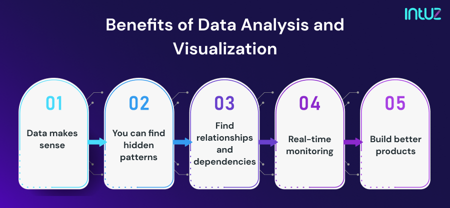

Data makes sense
Data analysis and visualization help in making sense of the data. As raw data can be in various formats, it is not easy to filter it out manually. Therefore, data analysis techniques like predictive analysis, descriptive analysis, etc., can be used to make sense out of it quickly.
Further data visualization types can be used to plot or present the analyzed data in various visual forms. Visualized or graphic data is easier for humans to understand and process quickly.
You can find hidden patterns
Data analysis can filter out data of a certain type. For example, data about a sensor from the past 1 or 2 years. Based on the analysis, a visual bar graph can be plotted. The bar graph can help you find patterns in measured parameters like temperature, speed, etc.
If the device has failed, you can know after how much time it failed, find a pattern, and project a time when it may fail again. This can help you prepare for downtime. This can be done in every field to build strategies for the future.
Find relationships and dependencies
You may not know how some things are happening, but once you analyze the data and put it in a visual form, you can. There may be some patterns that you may not be aware of while they are there. For example, if you have a fleet of delivery vehicles and one of them gets late to the destination every day.
With manual unorganized data, you may ignore it or may not even see it. But, with data analysis and visualization, you can see a relationship between the vehicle getting late and the route it follows (let’s say route X). Every vehicle that follows route X gets late as it is a busy one.
The crux of the example is that you get to find out various relationships and dependencies with data analysis and visualization.
Real-time monitoring
There can be scenarios where real-time monitoring is crucial. Data analysis and visualization can help in it. How?
Take the example of the mobile communication system. As all of us rely on mobile phones for calling, the mobile switching centers, BTS towers, and BSCs should be up all time. IoT sensors can be fitted at their locations to detect any changes in the fitted equipment. Temperatures, signal strength, etc., can be monitored in real-time to ensure zero downtime. If, in any case, there is a glitch in any parameters, local troubleshooting teams can be deployed to take care of the issue.
Build better products
With proper data analysis and visualization techniques in place, you can build better products and services. Let’s take the example of an electrical appliances manufacturer. If you have all the manufactured electrical appliances fitted with IoT sensors, they can provide you with a live data feed, no matter who has purchased them.
With this data analyzed and visualized on a dashboard, you can monitor the health and performance of the product. The visualization of product parameters can help you find faults and errors and improve the product in the future.
Data Analysis and Visualization Techniques
As we are well-versed with the concept and benefits of data analysis and visualization, let’s discover their techniques!
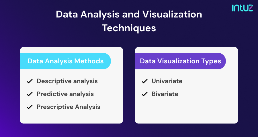

Data Analysis Methods
Descriptive analysis
The descriptive analysis technique is one of the basic methods used to analyze data. It can be used to calculate mean, variance, standard deviation, range, etc. These parameters are simple but can uncover various valuable aspects of the data.
For example, in a communication system of a town, business owners can know what the average signal strength is.
Predictive analysis
The predictive analysis deals with modeling future data based on past data. It simply means that based on the previous data, firms can know what future data could be and how it can affect performance.
For example, if a sensor is fitted in a firm’s device (say a turbine), with the past temperature, speed, power requirements information, we can predict how long it can work without any repair.
Linear regression and polynomial regression come under predictive analysis.
Prescriptive Analysis
This type of analysis is done to make a decision for the future. Unlike the previous two approaches, prescriptive analysis uses machine learning, natural language processing, and image processing to deliver results.
In a mobile communication system, if you want to know how to improve signal strength while keeping the temperature and other parameters within limits, prescriptive analysis can help you. You can increase the number of variables and even change their value to get the results faster.
Data Visualization Types
Data can be represented in various ways such as:
Univariate
- Box and whiskers plot: The box and whiskers plot is used to get more statistical detail about the data. You can find out the minimum and maximum values, outliers, etc. It can also help you find out the Interquartile range(IQR).
- Violin plot: Violin plot is a blend of both box and distribution plots. You can get the visual description of a distributed data set, whether they are skewness, multimodal, or any other.
- Distribution plot: The distribution plot is used to study the distribution of data. It is also used to find the correlation between two factors plotted as probability density function and histogram.
Bivariate
- Scatter plots: This is one of the widely used data visualization types. The plot contains dots plotted with respect to two or three variables. Scatter plots are used to observe patterns and clusters within data.
- Pie charts: Pie charts are another interactive data visualization method. They are used to measure various variables in terms of percentages, volume, etc. A pie chart is divided into sectors representing each variable.
- Interactive maps: Interactive ways are a great visualization tool to keep a check on your fleet of delivery vehicles and inventory. Indoor mapping is the best for inventory tracking in a warehouse.
- Line graphs: Line graphs are one of the easy-to-understand data visualization types. They are used to observe changes in a parameter over a time period. It is the most commonly used type by industry analysts.
- Bar charts: Bar charts are just like histograms with the difference of more bars representing multiple parameters that can be plotted on a single graph. Companies with different departments can use them to monitor their progress in various months.
The data visualization types are not just limited to these. There are many other visualization types that can be used to showcase data in a better way. Moreover, there are countless variables too that can be presented.
Why is Data Visualization important?
Data visualization is extremely critical for businesses to excel in the 21st century. Here is why!
- It can uncover factors that affect user experience to provide better service.
- Data visualization can help you reduce post-sales service costs through predictive analysis.
- It can identify areas that need improvement.
- It can help you regulate your equipment and labor costs.
- Analysis and visualization of data can help you build better products.
Conclusion
So, in short, we can say that data analysis and visualization are the backbones of industries using IoT. Without these methods, they are just gathering data and filling up the cloud storage. However, with proper data analysis and visualization techniques in place, businesses can do a lot more than just provide services.