

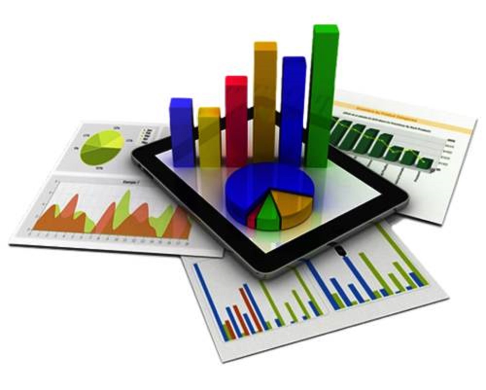
The main purpose of data analytics is to uncover hidden meanings in data. If it were easy to look at raw data and interpret what it means, there wouldn’t be a need for sophisticated data analytics. Although a well-trained analyst can look at a model’s mathematical output and make inferences about the data, those inferences aren’t always easy to explain to others. To clearly explain the results of most models’ output, you need to draw a picture.
Visualizing data isn’t just a nice thing to know; it’s critical to conveying meaning to other people. Technical and non-technical people alike benefit from good data visualization. Sometimes a bar chart most clearly explains data visually; other times a pie chart is better. Knowing how to visualize your data for the most significant effect is an important skill that improves with experience.
One of the most critical parts of any analytics project is presenting the results. Choosing the right visualizations for showing your results can make or break your presentation. In this article, you discover ten tips for visualizing data. These tips will help you assess your data and choose a visualization technique that will most clearly convey the story your data wants to tell.
Checking the landscape around you
Just like the great scientists of our age stand on the shoulders of the giants who came before them, you should take the opportunity to learn from existing visualizations. A quick Internet search on visualizing data will give you many ideas on what kinds of visualizations others have used, pointers on how they were done, and even some potential pitfalls.
In many cases, you can visualize a specific type of data in several ways, and seeing how others have done it might give you some ideas. And if you’ve already created visualizations of your data, seeing someone else’s approach might inspire you to improve your work.
To start, look at an example from the king of data, Google. This image shows a visualization of the Ethereum blockchain from BigQuery, Google’s big data analytics platform.
Leveraging the Blockchain community
Many analysts and data scientists of all skill levels are online and willing to help point aspiring data visualizers to the right datasets and tools. Stack Overflow, Reddit (and appropriate subreddits, such as the one for data visualization and predictive analysis.), and Kaggle are all great places to network online, ask questions, and learn how to build first-rate visualizations quickly.
Make friends with network visualizations
One of the many data visualizations in computer science is the directed acyclic graph (DAG). DAGs have many uses and indications, and it’s easy to dive deep in a short period of time. For our use, let’s stick with a simple explanation of DAGs. A DAG, also sometimes called a network graph, is a directed graph of vertices and edges. Vertices are generally stated, and edges are transitions from one state to another.
If you’re wondering how DAGs remotely relate to blockchain data, remember that blockchain technology excels at handling transfers of ownership. You can represent a blockchain transaction as two vertices (from an account and to account), and an edge (amount of transfer). Using a DAG (network graph), you can visually show how assets are transferred from one account to another. Network graphs make it possible to visualize any transfer, such as in a supply chain blockchain.
Recognize subjectivity when visualizing Blockchain data
Whenever you engage in cryptocurrency or other blockchain data analysis and visualizations, you should recognize that legacy systems often calculate value differently than new systems, especially new systems that incorporate cryptocurrency-based transactions. The value of transactions and the currency itself is subject to at least some degree of subjectivity.
For instance, it’s common to explain how blockchain transaction fees are far cheaper than the real-life processing fees they should replace. This may be true today, but if the value of cryptocurrency changes dramatically with respect to fiat currency, the relative values may change as well. A blockchain transaction fee today may seem very low, but worldwide financial turmoil coupled with a global strengthening of trust in investing money through cryptocurrency exchanges could invert today’s value perception.
When you analyze and especially when you visualize, make sure you deal with any ambiguity that relative valuation may cause and communicate it clearly to the audience of your visualizations. Likewise, if your visualizations are built on any assumptions or constraints, be sure to note those as well. You want your visualizations to stand on their own as much as possible, not open to wildly different interpretations by the audience.
Use scale, text, and the information you need to visualize your data
Blockchain analysis is a data-rich environment, so you need to make sure you don’t overwhelm your audience with too much information. Providing too many nodes or colors or excessively specific visual markers can make visualizations confusing, which misses the point of visuals. Determining what is “too much” is a bit of an art form. In general, use your best judgment and make sure you include only the information you need and are presenting it clearly.
Consider frequent updates for volatile blockchain data
Although it’s true that data in a blockchain block never changes, new blocks are added every few minutes or seconds. Regardless of when you execute an analytics model on blockchain data, the volatility of the blockchain makes your analysis stale almost immediately. New transactions are submitted in a nearly continuous stream, and any of those transactions could affect your models.
Your choice is to either frequently update your model and its associated datasets to be relatively current with the live blockchain or clearly state the highest block represented in your model. The latter approach tends to be easier but more confusing. Just reminding your audience that a model is based on outdated data generally doesn’t communicate the potential risk of relying on old data. In most cases, frequent updates mean more accurate results.
Get ready for big data
Blockchain analysis gives analysts access to massive amounts of information. If you want to successfully analyze and visualize large sets of data in compelling ways, both your visualization tools and the hardware that runs them must be capable of handling the load.
Hadoop is one of the most popular options for big-data analysis. On the visualization side, Jupyter, Tableau, D3.js, and Google Charts can help. A little research into the right tools goes a long way.
As far as hardware, make sure your CPU and memory are up to the task – you’ll want at least a quad-core CPU and 16 GB of RAM. You can run analytics on big data with less, but your performance might suffer.
Visit the following websites to get more information on visualization tools that are ready to handle big-data analysis:
- Jupyter: This extremely useful toolset supports visualizations of datasets from small to extremely large. Learn about the products from the Jupyter Project; you’ll be glad you did.
- Tableau: Tableau is a market leader in big data analysis and visualization. This product is mature and integrates with most large-scale data handling and high-performance processing platforms. For an enterprise-class analytics framework, Tableau is hard to beat.
- Google Charts: The Google Charts website says it all: “Google chart tools are powerful, simple to use, and free.”
- js: The Data-Driven Document JavaScript library (D3.js) provides the capability to visualize big data using many techniques in JavaScript programs. If you’re using JavaScript to build analytics models, D3.js should be on your evaluation list.
Protect privacy in your data visualizations
In today’s hyper-regulated and privacy-sensitive business environment, you must ensure that you’re using a large enough dataset or partitions to avoid the possibility of associating any unique individual with the data your audience views. To make matters worse, even large datasets or partitions may not be enough to protect privacy.
Sophisticated re-identification capabilities can infer unique identities with what seems to be a minimal amount of data. In addition to taking care to preserve privacy when you build datasets, your models must also be built to preserve privacy in the results they produce.
Let your data visualizations tell your story
Any time you attempt to digest a large amount of data and present results, it’s easy to overwhelm your audience with too much information and complex visualizations. Just as important as creating easy-to-understand visualizations is ensuring that they contribute to what you are trying to say. This point is true for any visualizations, not just those associated with blockchain. Keep in mind the big picture you’re creating.
Challenge yourself!
Blockchain is an emerging technology and its uses are still being discovered and fleshed out. Keep up with the latest research, papers, and competitions on sites such as Kaggle to keep your analysis and visualization skills sharp. Take online courses on visualization topics and tools and just keep learning!
